Today, you no longer need to be a data scientist to build useful reporting dashboards. With plenty of drag-and-drop BI tools to choose from, anyone can build interactive data visualizations.
But there’s more to data visualization than simply creating beautiful charts and graphs. Which data is useful to visualize? Are your data in the right format to be visualized? And how can your data visualizations make predictions about the future?
These are all difficult challenges you could run into when creating data visualizations.. Luckily, new AI technologies are making these tasks easier. In this article, we’ll discuss 4 examples of using ChatGPT for data visualization to uncover richer insights from your data!
Have you ever worked with complex datasets containing hundreds of columns? Then you’ll know the pain of deciding which data to visualize. Analyzing data relationships and correlations is difficult and time-consuming. With so many options, it can be overwhelming to decide which combinations of data make sense.
With the help of language learning models, and AI-powered applications like ChatGPT, organizations save countless hours in the process. For example, let’s say we have a dataset about the NBA playoffs. We can ask ChatGPT to make some suggestions.
Below is an example of a prompt your developer or data expert could use. Simply tell ChatGPT what your dataset looks like, and ask for some suggestions.

Here’s an example of the output you could receive.

Even if the output isn’t perfect yet, it’s a great way to move past the blank page. It’ll get you going, and you can refine along the way.
Want to take this approach to the next level? You can even hook up OpenAI to your BI tool of choice and create automated data visualizations with AI. This AI-powered dashboard tutorial is a great example you can spin up quickly!
Besides using ChatGPT for data visualization, you can also use it to enrich your data. If your dataset contains limited information, you may want to add more information to generate smarter, richer insights. Below are just a few examples of columns you may want to add to your dataset.
ChatGPT can help your developers uncover useful scripts to add these enrichments to your dataset. For example, the prompt below asks ChatGPT to rate the sentiment of customer feedback.

The result is a Python code sample with instructions to get started. With this output, your developers can apply this process at scale to analyze millions of feedback snippets.
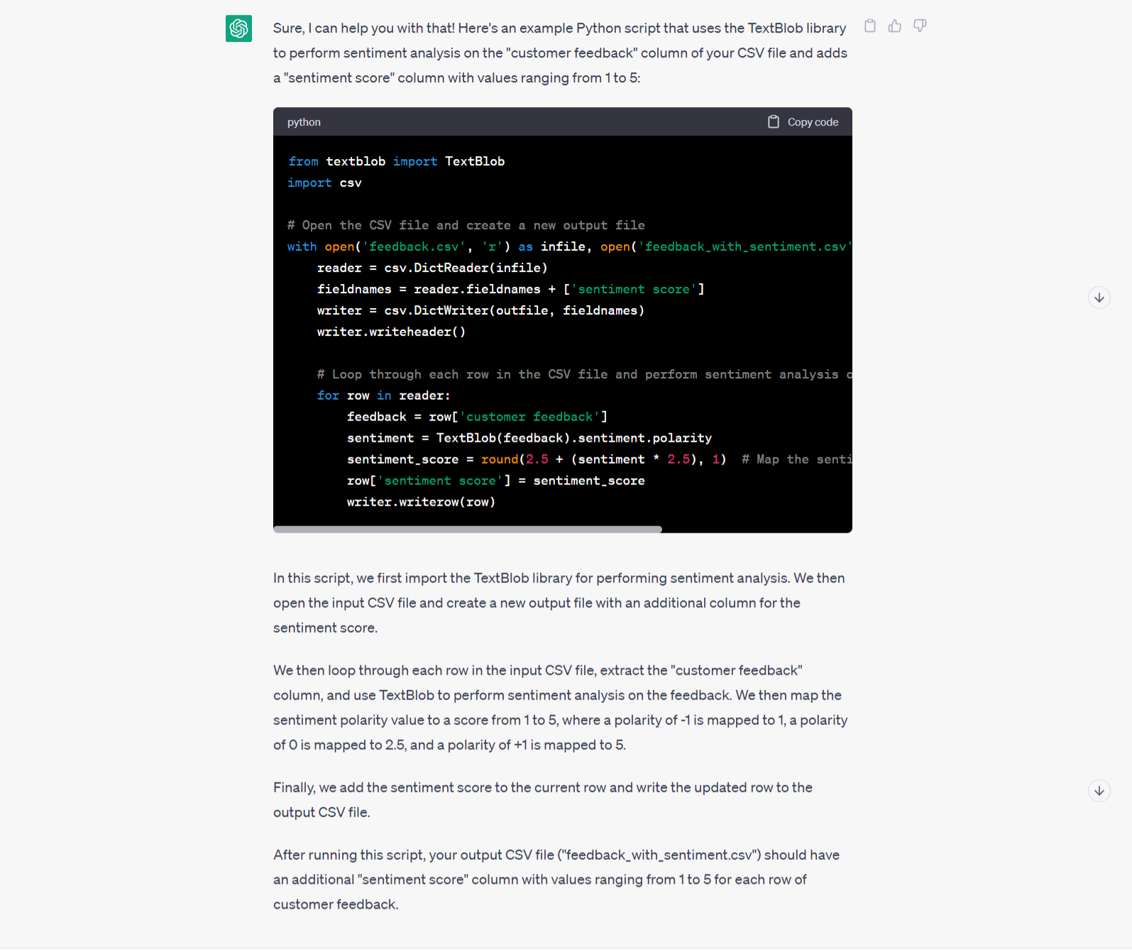
Developers and data scientists can save hours of browsing Stackoverflow by using ChatGPT. And even non-technical staff can benefit! As a marketer who had never worked with Python before, I was able to generate a set of coordinates for a mock-up dataset in Python in less than 15 minutes. ChatGPT walked me through every step!
Visualizing historical data is crucial to learn from your past efforts. But if you only act on past learnings, you may risk running behind your competitors. Instead, what if you could predict risks and opportunities before they happen?
More and more organizations are starting to leverage predictive analytics to make better decisions based on forecasts. But predictive analytics is a specialized field requiring deep expertise. However, with language learning models like GPT-3.5 and GPT-4, the jump to start experimenting with predictive analytics has become smaller for developers. They can train GPT on their historical data, and start building AI assisted data visualizations.
Garbage in = garbage out. Nothing is more true for data visualization. If your data is unstructured and your data model isn’t optimized, building meaningful data visualizations will be tricky. Although data cleaning and modelling is less exciting than creating pretty charts, it’s an essential step you can’t overlook.
Luckily, ChatGPT can help with the tedious process of data cleaning and data processing. It can help out spotting anything that could be wrong with your dataset.
The potential of new AI tools like ChatGPT is enormous. But many people also worry about how AI will impact their career. Instead of looking at AI in fear, smart software teams are embracing its potential.
Those who learn early on how to leverage AI for data visualization will lead the pack. They will become more efficient and grow their skillset even faster. AI and tools like ChatGPT are here to stay, and they have the potential to revolutionize many industries. Data visualization included.
Curious about how you can use ChatGPT for client-facing dashboards? Get in touch with our product experts to explore the power of embedded analytics.