Have a look what we're working on. Join us in making Cumul.io even better!
Is this important to you?
By submitting you agree to the Terms of Use & Privacy Policy
Imagine you could craft really compelling data stories in any communication platform or web page, outside the canvas of your dashboards, using components from various existing analytics assets?
What if you could slice and dice dashboard components and share insightful data-driven context across multiple parts of an application in a flexible, consumer focused manner?
Let us know your ideas and use cases where decomposing dashboards and assembling new data stories would be the answer to!
By submitting you agree to the Terms of Use & Privacy Policy
In addition to a rich library of over +40 good looking charts & items, we also love our creative, empowered and engaged users: we're looking into how we could offer you a way to import custom built charts in your Cumul.io dashboard!
By submitting you agree to the Terms of Use & Privacy Policy
Being able to sort datasets alphabetically, numerically, ...in charts is what users obviously expect. However, sometimes you want a different type of sort in your chart.
Two possible solutions we're investigating:
Let us know what you would prefer!
By submitting you agree to the Terms of Use & Privacy Policy
There exist many types of visualizations each serving its own purpose.
Today we already have +50 items in our list, but we are always looking to extend it with new valuable and commonly used (or underestimated) items.
Let us know which visualizations we should absolutely add to our library and what your use case is!
By submitting you agree to the Terms of Use & Privacy Policy
We're continuously working on improving our existing set of charts.
Do you have a specific request concerning a specific chart, do not hesitate to send it to us!
By submitting you agree to the Terms of Use & Privacy Policy
Wouldn't it be convenient and fun to design dashboards together with colleagues in real time, and see immediately what insights your colleagues find interesting to visualize?
Realtime collaboration on dashboards would allow you to analyze and/or build dashboards together with your team. You would see who makes what change and at all times you would share the same view on data (provided they have access) with them.
By submitting you agree to the Terms of Use & Privacy Policy
Bumping into use cases where you want to animate data over time? Let us know!
We are exploring an animated time travel for our charts. Automatic animation over time allows you to easily identify changes over time and spot new insights. Some things we're reflecting about is controlling the speed of animation, settings for continuous loop and identifying the best query patterns depending on the data source.
By submitting you agree to the Terms of Use & Privacy Policy
It is our mission to increase your analytical power, and make sure smart decisions are taken!
We are looking into the possibility of helping you stepping up your game by proving access to easy-to-use analytics capabilities like:
By submitting you agree to the Terms of Use & Privacy Policy
In data driven decision making scenario analysis can be an important task.
To make this task even easier we are examining the possibility of using variables (or parameters) in interactive objects and calculations on top of your data.
Change one or multiple input variables to assess output, and compare your best, base or worst case scenario e.g. double the price of a bottle of soda and reduce the volume in a bottle by 15%, ..
The goal is to easily allow you to create a 'What-if' playground for your stakeholders allowing them to review all possible outcomes, test decisions, understand potential impact of a specific variable and identify risks, ... before taking a decision.
By submitting you agree to the Terms of Use & Privacy Policy
Most people are familiar with traditional, statistical approaches to explore data and discover a limited set of insight types.
We want to take it one step further, and enable insight mining to interpret all your data and generate automatically relevant insights taking into account multiple dimensions & measures.
The insights could be ranked based on overall interestingness to the end-user and presented automatically as a set of relevant data visualizations!
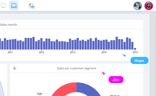
In a snapshot, users could spot
As part of the R&D track we started, we are also investigating to enrich these minded insights by retraining based on explicit & implicit feedback.
Get in touch if you want to find out more about this R&D project!
By submitting you agree to the Terms of Use & Privacy Policy
We recently initiated a research track for a visualisation recommendation engine. This engine would analyse a specific dataset and automatically propose interesting charts on it.
This could help a lot in data exploration exercises but can also empower less data-savvy end-users: an instant dashboard proposal of what is observed in the data and/or could be interesting to further explore!
The results would be pre-configured charts that will be easy to manipulate just like any other chart, and would give you a kick start to navigate in the user interface with already relevant charts.
Wanna stay tuned on this project? Let us know! Or share any relevant use case you come across.
By submitting you agree to the Terms of Use & Privacy Policy
In some cases, like with high velocity real-time streaming data, you don't have access to the full history of data, but only to the last value of that moment and its updates. And updates typically come at high velocity, as in milliseconds.
Today you can already send, store & update data in Cumul.io, but with high-velocity streaming data you can bump into our API-limits.
By providing a specific API-endpoint or a special dataset type 'streaming' (we're evaluating several options) we could work out a solution to deal with this type of data.
Let us know what your streaming data use cases are!
By submitting you agree to the Terms of Use & Privacy Policy
We are working on extending plugin-connectors to enable sending SQL queries to plugins: A user could then write SQL queries in the UI. These would be sent over to the plugin in the query request.
By submitting you agree to the Terms of Use & Privacy Policy
We are working on extending plugin-connectors to enable geographical data coming from the plugin. No need to upload a topojson or geojson file separately anymore!
By submitting you agree to the Terms of Use & Privacy Policy
We are working on extending plugin-connectors to enable hierarchical data coming directly from the plugin. This eliminates the need to create a hierarchy on top of the dataset (manually or via API).
By submitting you agree to the Terms of Use & Privacy Policy
We are keeping an eye on commonly used data sources that are valuable in an embedded analytics setting.
Do you have a data source for which we do not yet have an out-of-the-box connector and that is commonly used. Let us know!
Tip: Know that for data sources for which we do not have a connector, you can always use our plugin solution.
By submitting you agree to the Terms of Use & Privacy Policy
For many organizations it is important to be able to audit usage and access of data. As an organization owner, it would be interesting to have a detailed view on:
Diagnose platform performance, monitor behaviour, and take actions based on audit & log trails to improve application usage.
By submitting you agree to the Terms of Use & Privacy Policy
Our dashboards already support numerous languages, but our application itself (in which you edit your dashboards) is limited to English, French, Spanish and Dutch. We're looking to add more platform languages. Let us know which ones you would need!
By submitting you agree to the Terms of Use & Privacy Policy
In addition to existing login options, other options such as Google Sign In or SAML SSO can be interesting to extend secured access possibilities.
By submitting you agree to the Terms of Use & Privacy Policy